How the Lighthouse Rising production Company Logo was created
Lighthouse Rising, the production company I have used long before I began my media work for my animated shows, my video essay series 'Idle By The Campfire', my videogame projects and now my Opening Title Sequence. The name stems from a two part gesture, the lighthouse placing as a peculiar fascination of mine with it being a symbol of hope, a symbol of progression and a symbol of defiance, against, in almost a poetic sense, the whims of the greater forces, in literary terms the nights and the storms, and in a metaphorical sense against the harshness of creative bankruptcy and the loss of artistic integrity in media. A lighthouse is a beacon that guides the weary home, that lights the maw and coddles the sailors weary to a stead fast bed, and as one such person wishing to do something great, it became a symbol to me of just how far someone can go when inspired. The rising part bears a similar connotation, speaking more to the direct idea of inspiring people, rising up to light the way. As pretentious as that all sounds, symbols and logos have always been something I've taken a fancy to with the many intricacies and messages they convey through simple iconography, a trend that surfaces with the titular 'World Eaters' of Synth and their bloody icon.
https://uk.pinterest.com/MipplyRising/lighthouse-rising-logos/
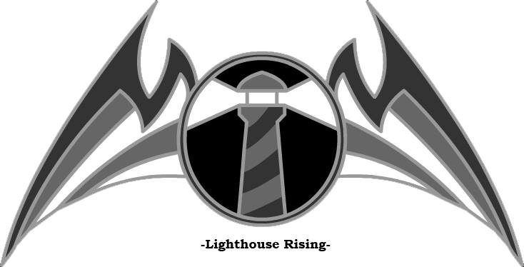
This first symbol, drawn in roughly mid 2012, depicted a simple but visually interesting icon lacking much in the way of creativity besides being monochromatic in scheme, allowing for the characteristics of the logo to stand out more, namely the lighthouse and the two great wings, bat-like in aesthetic to embody the strength of an un-suspecting thing.
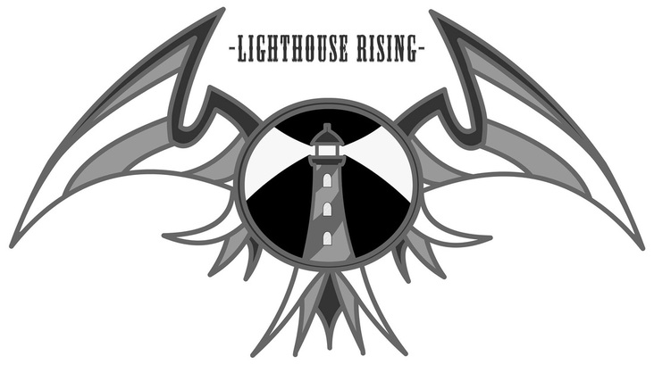
The second logo, drawn in mid 2013, has stood as the studios symbol for several years due in part to its continuation of the monochromatic scheme but primarily for its wings; modeled this time after one of my favorite animals, the Kestrel. Though decidedly more wing like with the bladed feathers and additional bottom ruff, the symbol also features a more detailed lighthouse with un-outlined light beams, representing the un-tethered nature of creativity. The lighthouse also a personal reference to a piece of artistic work that first inspired me to think about media as an expressionist space, namely, Bioshock, which heavily featured them as a gate way to their strange and interesting worlds. This isn't to say that the lighthouse in the picture is an exact replica of the ones featured in the game, it's just a subtle homage to a work that influence me, a theme common to almost all of my designs.
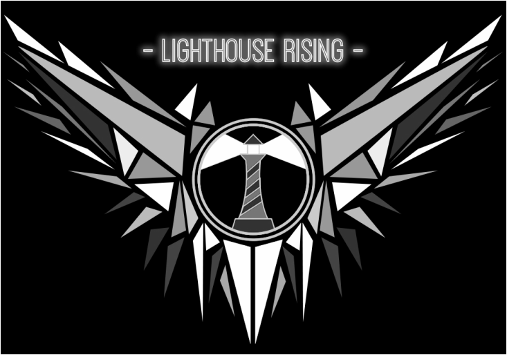
And here we have the final, actual logo for my production company, drawn the morning of this post and to be used from here on out until I deem it unrepresentative of my ideals. As of late, I've found an affinity with polygonal artwork; shard-based mosaics and splintered triangles scattered with just the right color gradient to imply shade but with enough individual definition to make it distinct from traditional techniques. The wings this time were modeled after another of my favorite animals, the Owl, with wide, sweeping, violent spans encompassing the central lighthouse. The polygonal art style also spoke the darker, more violent nature of the content I am to be creating, not only with this horror movie OTS but also with my other work which has matured as I have, an idea I felt need be reflected in the design.
