Production company Research
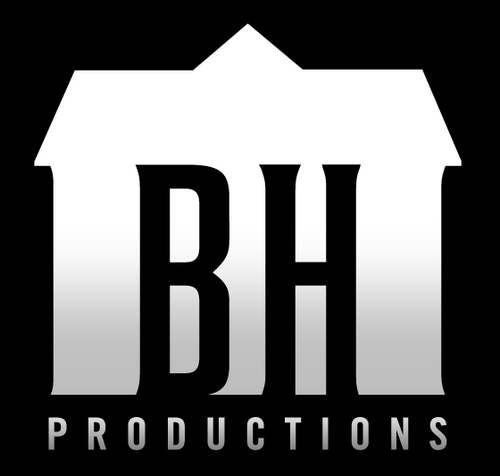
Blum House Productions
Famed for their high profit, slim budgeted horror films, BlumHouse is an American production company sat as Hollywood's star pupil, or at least, its share holder's favorite step for its ridiculously high profit rates and low production costs. With titles such as Paranormal Activity, Sinister, The Purge and Insidious on their roster, Jason Blum's gold mine of a company has succeeded in grossing a whopping $1.2 Billion worldwide with only a combined budget (across all their films) of $40 million. To put that in perspective the three highest grossing films at the time of writing this, Avatar, Titanic and Jurassic World, cost $425 million, $200 million and $150 million respectively, are deemed less profitable based on the return for investmant than Paranormal Activity which cost $450 thousand with marketing included and only $15 thousand excluded to make.
It's only fitting then that their 16 second production company video showcase their attitudes to film making, displaying in its short run time several key icons of horror, mostly paranormal horror, all within a scarcely decorated, glumly lit room: The staple of low budget horror.At first, there is a whirring chair, disenfranchised from the shackles of gravity and spinning at a more-than-placid pace, suggesting that otherworldly happenings are ahead of this ident. Although unlikely, it could also be a subtle nod or homage to the nature of film as an illusory medium where in so called 'movie-magic' can leave the audience's mouth agape in awe with the floating object trick synonymous with street performance and theater, although such a leap is strenuous at best. Moving forward, the defining light of the scene, a 'Twilight Zone' style door complete with decaying markings and ominous fog, is presented at a canted angle, slamming shut as the rising music crescendos with an all too satisfying thump and scream. On a slight aside, it is worth mentioning that the light being snapped away visually representative of having your safety snatched away, a metaphor if you like for a lack of escape or a perceived looming presence. As the camera moves through the environment, we see even more horror symbolism such as the titular Yurei-esk girl, the flying books and the flashing lights, once again referencing synonymous material with a small room to indicated the genre that the company is known for and the diversity of its catalog. Audibly this trend is continued with the crying, ghostly voice in the radio static, a reference perhaps to legendary horror franchise 'Silent Hill' or even to the likes of 'Poltergeist'. Even more creepy sounds are layered up, adding to the sensation of encroaching and overwhelming fear before a sudden stop; the new interest point is establish by a dim swinging light and the manifestation of green text, connotative of the wicked, the envious or the sickly, After the build up of drama, the new light source, the absence of any overbearing sounds and the actual forced perspective of the title indicate to the audience what all of these efforts are at the hand of before fading to black.
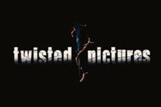
Twisted PIctures
With a modest starting in 2004 by the now legendary Mark Burg and company, Twisted Pictures has risen to be one of the most note worthy production companies in the industry with its headline series, SAW garnering a huge following and a massive box office appeal despite the decline in the franchise's critical reception. The company itself has also produced two video games, based on their central franchise, neither of which are particularly favorable as far as interactive media is concerned.
Although simple, the 'Twisted Pictures' production company video is memorably distinct. At first we have the black-to-white gradient sans-serif font centered on screen and accompanied by a hideous lacerating steel sound effect which if revealed to be a particularly rusty thread of barbed wire. The rusted wire, although not as iconic as a ghost girl or a 'Twilight Zone' door, is still associated with security, being trapped, threat, disease and decay, seemingly appropriate thematic ideas considering that the company was set up for the original SAW film. From there, as if sentient, the wire takes on a snake-like motion, burrowing through and around the letters from either side until they meet at the middle where in a rail way rivet descends with some speed and winds the wire to a menacing tightness. Characteristically, the rivet is also colored grimly, textured a metallic shade and jagged in almost every regard, serving to emphasize the hostility and threat of the picture. To wrap up we get a lightening flash, another, more child like memory of fear and the wire is gone, leaving the scratched text and the central, menacing rivet entwined in the remaining wire. This sting is short and simplistic, agreed, but the pallet fits that of its first and most notable film, SAW, with a deliberate grimy aesthetic you'd be hard pressed to disassociate from the snuff like influences the franchise has always drawn from for its representation.
Dark Castle Entertainment
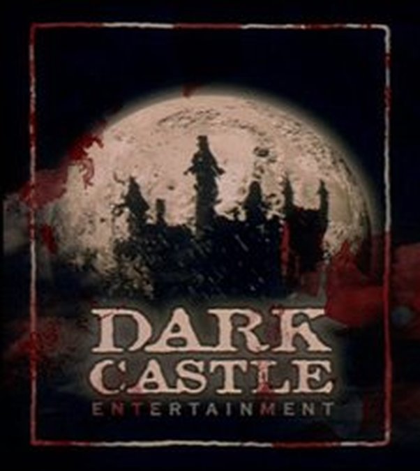
Dark Castle Entertainment, the production company behind cult classics such as 'Orphan', 'House of Wax' and 'Splice', is coming up to its sixteenth year of running after its establishment in 1999 by several people, importantly of which were Joe Silver and Robert Zemeckis, who wanted to pay homage to classic film maker William Castle with a studio of their own. Much like the Michael Bay founded studio, Platinum Dunes, Dark Castle aimed to capitalize on the beloved films of yesteryear, namely Castle's movies, by remaking them for a modern generation, an attitude that, at best, can be described as desperate and creatively bankrupt, and that at worst, can be described as parasitic, artistically offensive and indicative of the terrible trends Hollywood has settled into at this point in time.
We start this little escapade then with deliberately nostalgic music paying tribute to Castle's era of film scores as a dutch close-up shot of a black-and-white gargoyle's eyes flare onto screen, referencing the 1931 classic 'Dracula' and general Gothic iconography. As the camera spins into profile, the close-up transitions to a mid-angle and eventually to a wide angle establishing shot where in the music ramps up and the color pallet is fleshed out into a sanguine swathe before a piercing yellow moon, also synonymous with twentieth century horror and Gothic culture, overrides the entire logo just in time for the negative of the castle can become apparent and the title to be displayed. The dramatic music merges nicely with the lightening ques to evoke an almost rose-tinted connotation for the studio right before the faded white border, representative of an old piece of film, crops the image into a trade-standard size. Although there isn't a lot to particularly pick apart about this sequence, it seems to have its sensibilities grounded clearly in the legacy of film which, given its purpose as a grave digger of a studio pitted with rehashing what was once popular, seems only appropriate.
Lighthouse Rising Production Company Video
If I picked up anything from the other videos, it was that the sting should be short and memorable, unhampered by the tacky bombast of the the distribution company. To that extent, I ignored the overly dramatic Blumhouse PCV which, despite being well done, was too corny and long for the sort of horror I was pursuing, instead choosing to focus on the animated static shot from the Dark Castle video and the memorable sound design of the Twisted Pictures PCV. In my OTS, I used the uneasy sounds of the ocean (linking to the eerie ambiance in both a literal and thematic sense of a lighthouse) combined with a dramatic horn sound which punctuated the logo's transition in prevalence. I chose to use the harsh monochromatic colors for the symbol and the shattered wings for two reasons, one because it fits with the logo's lineage in and of that fact that they have always sported the black and white aesthetic and two because the introduction of color to the actual graphic would have spoiled the mysticism of the piece. The font you'll also notice is sans serif and modern, layered up three times with different shades of a gradient in order to create a modern yet visually ascending font. As for the red highlights, there is an argument to be made for the fact that it is a one man studio and that I have selected any 'I' to stress that fact, however, I personally believe it is just because the shape is linear and as such, represents progression.
